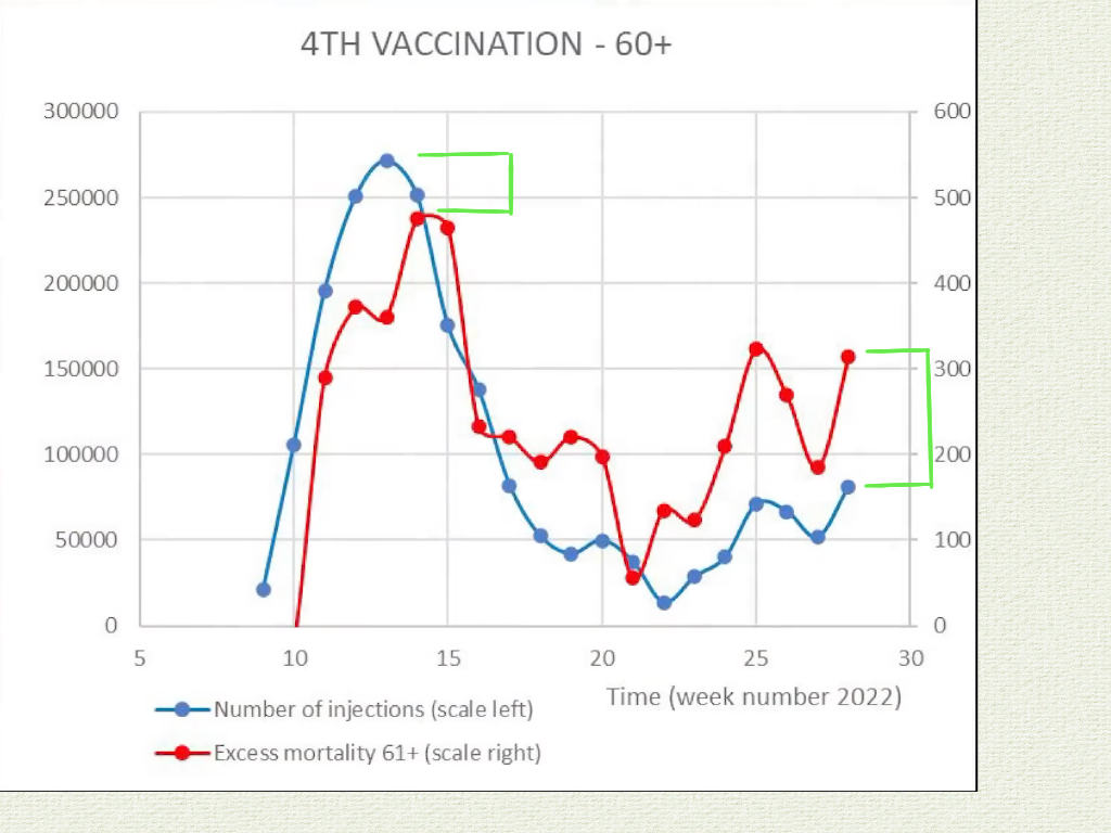
Latest study from Dr Malone's substack. Here's what's important and easy to understand:

High correlation of vaccination to increased all-cause deaths. Notice how the death rate rises over time. At week 10 the RED graph is about 9/10ths of BLUE graph and by week 25, RED is twice the size. The mRNA vaccines kill and they kill more over time. It's incredible that my government and media are deliberately misleading the public.
I'll never trust another word out of these evil circus clowns.

Comments